These are all the elements I decided to use for my sewer type maze. I wanted to make it a little more sinister. This is a very good start in my opinion though.
Wednesday, October 30, 2013
Monday, October 28, 2013
Labyrinth Hallway Final Phase
As you can see the first image is showing all the original elements without any type of editing. These were all the elements I ended up using for my labyrinth hallway. I am really happy with it. I feel I was able to incorporate all the elements rather well.
Wednesday, October 23, 2013
Labyrinth research phase
This is my concept for the labyrinth. I want it to be a newer version of the mythical labyrinth. So instead of stone and similar materials, I would use concrete for the floor and the walls. To me seeing the similar textures in the maze adds extra to the maze. This maze could be used for a first-person Survival horror just make it grimmer and it could definitely work. I feel I could make the labyrinths a lot harder and I will probably do so for the final project.
Monday, October 21, 2013
Larger Prop Item Final Phase
This is my final phase. I decided to do a mongoose instead than a building as this seemed simpler to do than a building. I have my line work, Final and research images. This wasnt so difficult to do it was just very time consuming.
Thursday, October 17, 2013
Large Prop Research Phase
All These buildings interested me in making a big skyscraper type thing for my game. Maybe being the place where you have to go to for the end of the game. This would be an important thing for my game. So I want to make it really important for my game.
Prop Final phase
For my final phase I decided to make the colors psychedelic. I feel like its a lot better looking and more set for the theme of my game. It isn't too difficult to do I just feel a lot better with this version of the tree. The colors just fit with everything else.
Tuesday, October 15, 2013
Prop and Color palet
This is the object I decide to do as I feel it could go very well with my game. I put the image I found next to it. This wasn't to difficult to make it just took time to get all the lines perfectly together. I really like how it turned out.
Tuesday, October 8, 2013
WK 06 Logo Final Phase
This is my new title screen that will be fused with my old intro. This is the first thing I wanted to change to make sure how much the contrast between the world and the actual tone of the game.
I will change the title and maybe try to make the background colors more brightly so you can really understand how grim this game it is even if it looks like a children's game.
I will change the title and maybe try to make the background colors more brightly so you can really understand how grim this game it is even if it looks like a children's game.
Thursday, October 3, 2013
Wk 6 Logo research phase
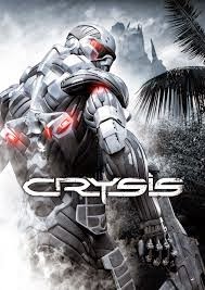
With all these posters we see that the font for each one is quite different and it can be easily recognized.
This is something I want for my game . Poster ideas and such should be similar with this.
I want to say that my last three are definitely my favorite. They feel right for my game in many ways. Especially because the main character is crazy so it just shows different things I could use to show this with just a title. Again even though my game seems like its calm and charming in reality it isn't.
Tuesday, October 1, 2013
WK 05 Intro Final Phase
I added all the things I wanted to add from my previous phase. I could improve the animations a bit and add some more things but I feel that the game cam be shown rather well.
Subscribe to:
Comments (Atom)


.jpeg)


